The Pareto analysis is used to analyse different concepts or models with each other. The analysation is done by comparing the KPI’s (Key Performance Indicators) of every model. The three main KPI’s are “Energy”, “Comfort” and “Investment”.
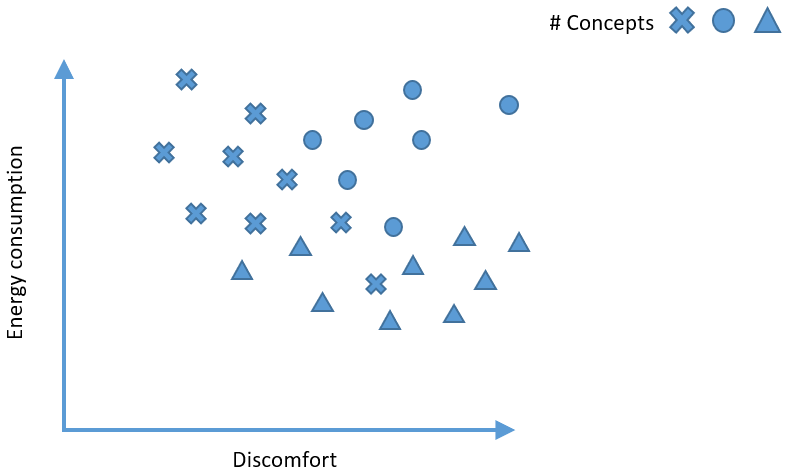
If for instance a lot of concepts are simulated and the results for discomfort and energy consumption are mapped in a graph. The most optimum concept would be in the zero point of the graph, meaning there is no discomfort or any energy consumption.
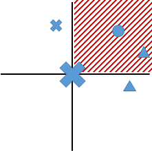
If the surroundings of every concept are divided into four quadrants, all the concepts in the second quadrant are suboptimal because they have higher energy consumption and higher discomfort. The concepts in the first and fourth quadrant are however not better or worse than the selected concept. It depends on the designer which concept is prefered. The concepts in the first quadrant have better comfort, but a higher energy consumption, while the concepts in the fourth quadrant have lower energy consumption, but a worse comfort.
When this is done for all the concepts and every concept which falls in any second quadrant is ignored, only a few “optimal” concepts remain. The remaining concepts can be connected to each other and this is called the “Pareto Front”.
In the Hysopt software, the Pareto analysis can be started by clicking on the icon on the left side of the screen.
Model selection
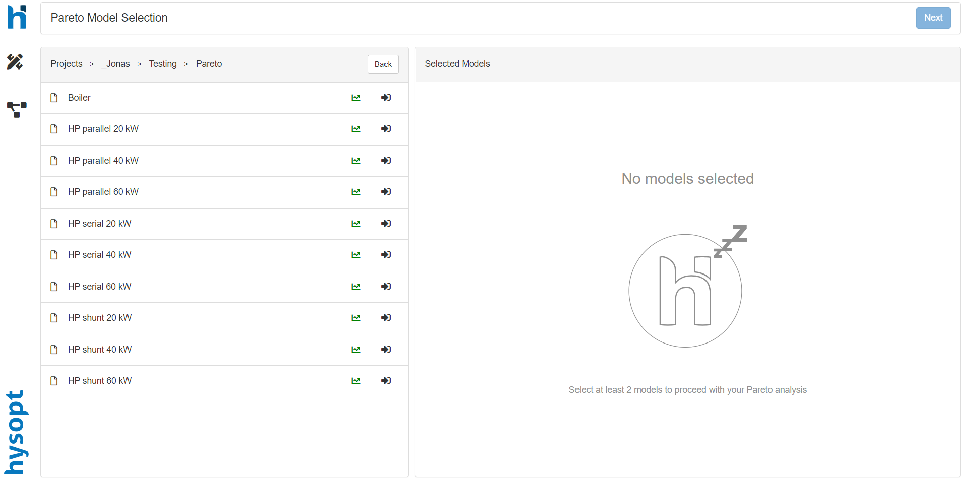
After clicking on the Pareto icon, a new page is opened with on the left the folder structure. In the folder structure, the user can navigate to the models desired to analyse.
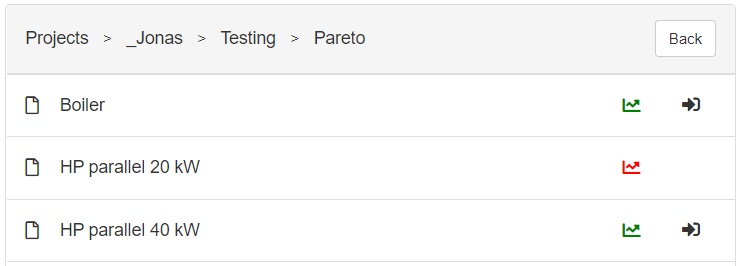
The models should be simulated to select for Pareto analysis. If the model isn’t simulated the graph icon is shown in red, if the model is simulated the icon is shown in green. The simulated models can be selected for a Pareto analysis by clicking on the arrow icon next to the graph icon.
After selecting at least two models for the Pareto analysis, the selected models are visualised on the right side of the screen. If a model is selected which isn’t desired, it can simply be removed by clicking on the “garbage bin” icon.
Specifications
After the model selection, the user should click on the “next” button on the top right corner of the Pareto dashboard. A new page will appear with the selected models on the left.
In this page, comments can be added for every model. By selecting a model, an input field is visualised on the right side of the screen.
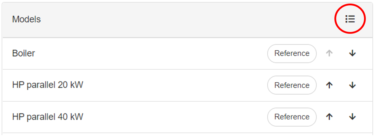
The order of the different models can be changed by clicking on the icon visualised with the red circle in the figure below. After clicking on the icon arrows will appear next to the models. The order of the models can be changed by clicking on the arrows. If the user clicks on the upward pointing arrow, the model will be switched with the model above, and the opposite will happen for the arrow pointing downwards.
Besides adding comments to models and changing the order of the models, a reference model should be selected. A reference model is needed to calculate different aspects like for instance “energy cost savings”. A model can be selected as the reference by clicking on the “Reference” button next to the models' name. After selecting the reference, the button turns blue.
Parameters
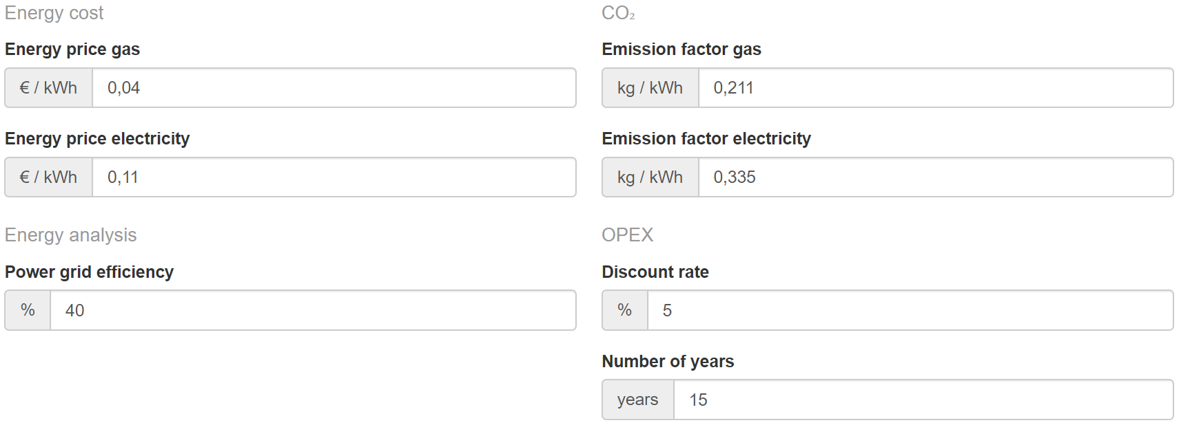
If a reference model is selected, the user can click on the “next” button on the top right corner of the Pareto dashboard. A new page appears with different parameters. The user should change these parameters if the correct values are known. The parameters are used for different calculations done in the Pareto analysis.
If the user has entered the correct parameters and clicked on the “next” button, a new page appears with input fields for the investment cost. The user should insert the correct material, installation and study cost for correct investment analysis.
Pareto analysis
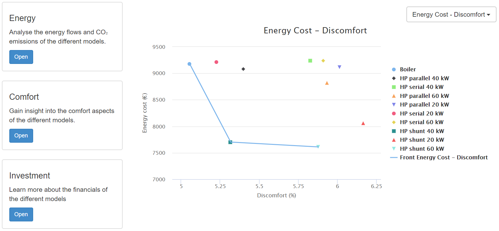
After the implementation of all the necessary information, the Pareto analysis can start by clicking on the “start” button in the top right corner. In the new page, a Pareto graph is shown with the “Energy Cost” and “Discomfort”.
The user can change the KPIs of the graph by clicking on the drop-down menu and choosing the desired KPIs to analyse with each other.
On the left side of the page, there are 3 different sections “Energy”, “Comfort” and “Investment”. Every section can be further analysed by clicking on the “Open” button.
Energy
First, the installed power of all the production units is shown with the percentage below.
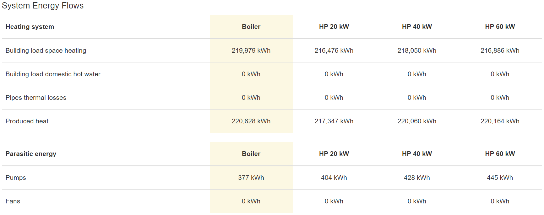
After the installed power, the system energy flows are clarified. The user should check if the building load of all the concepts are quasi the same. Otherwise, there might be comfort issues.
All the production energy flows are given for the production units used in the models, with the production efficiency ratios of said production units. The renewable energy production systems also have the operating time and the number of start/stops shown.
The delivered contributions of the production units are also summarised. With the contribution, the user can assess if the renewable production unit is contributing enough energy to the building.
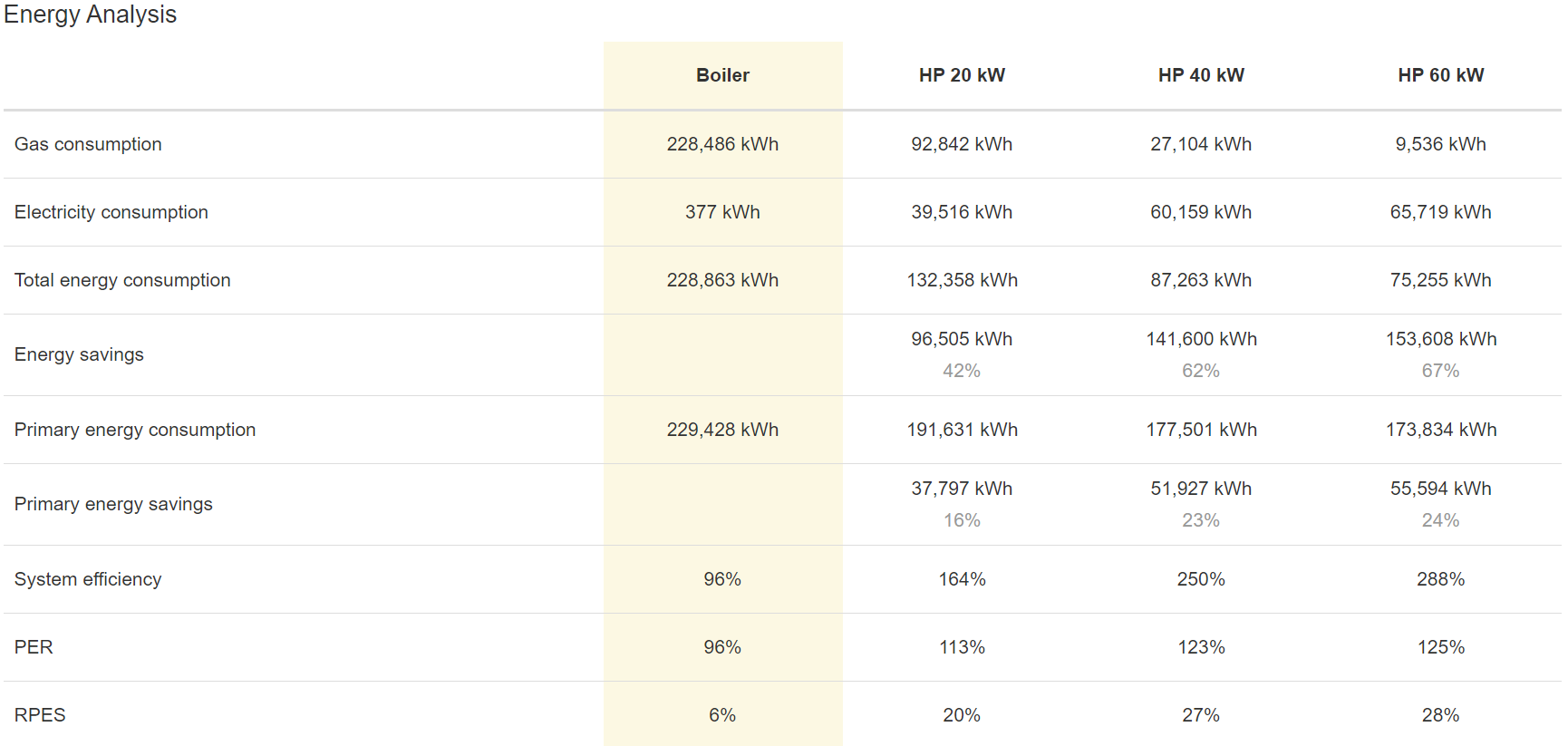
After the production details, the energies are analysed. The gas and electricity consumption are visualised, and with it, the energy savings compared to the reference is calculated. If CHPs (Combined Heat and Power) are used, the electricity production is also shown. Furthermore, the primary energy consumption is calculated using the input parameters from previous pages. With all the energy flows known, the system efficiency, the PER (Primary Energy Ratio) and RPES (Relative Primary Energy Savings) are calculated. More information on the calculations can be found in Pareto calculations.
The energy costs are also calculated with the energy consumption and the electricity and gas prices of the input parameters. With the energy costs known, the cost savings compared to the reference is calculated.
Finally, the CO2 emissions are calculated with the emission factors for gas and electricity. And with the emissions, the reductions are calculated.
Comfort
In the “Comfort” section, the general comfort aspects are visualised. The comfort ratio is the percentage of people who are satisfied with the delivered heating and/or cooling. The comfort improvement is calculated compared to the reference. The discomfort ratio is the percentage of people who aren’t satisfied with the delivered heating and/or cooling. The comfort class and main class is calculated and visualised. A detailed explanation of how comfort is quantified is found in Pareto calculations.
The comfort details give the percentages of how long the room temperatures are within a certain class.
Furthermore, the number of zones with a certain class or main class is visualised with the percentage compared to all the rooms.
Investment
In the “Investment” section, the optimisation costs are summarised with the calculated Hysopt project fee. The optimisation costs are implemented by the user in the parameter page. The calculation of the Hysopt project fee is explained on https://www.hysopt.com.
The energy cost savings from the “Energy” section are also visualised.
Finally, the investment analysis is shown with the NPV (Net Present Value), the payback and discounted payback period in years, and the IRR (Internal Rate of Return). More information on the calculations can be found in Pareto calculations.

