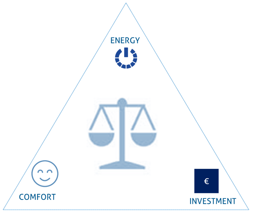
The Pareto analysis is used to analyse different concepts or models with each other. The analysation is done by comparing the KPI’s (Key Performance Indicators) of every model. The three main KPI’s are “Energy”, “Comfort” and “Investment”.
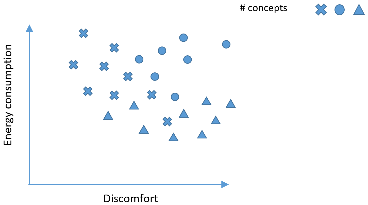
If for instance a lot of concepts are simulated and the results for discomfort and energy consumption are mapped in a graph. The most optimum concept would be in the zero point of the graph, meaning there is no discomfort or any energy consumption.
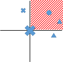
If the surroundings of every concept are divided into four quadrants, all the concepts in the second quadrant are suboptimal because they have higher energy consumption and higher discomfort. The concepts in the first and fourth quadrant are however not better or worse than the selected concept. It depends on the designer which concept is prefered. The concepts in the first quadrant have better comfort, but a higher energy consumption, while the concepts in the fourth quadrant have lower energy consumption, but a worse comfort.
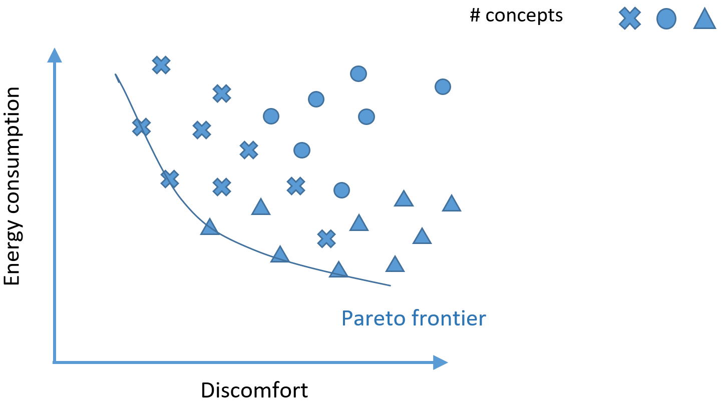
When this is done for all the concepts and every concept which falls in any second quadrant is ignored, only a few “optimal” concepts remain. The remaining concepts can be connected to each other and this is called the “Pareto frontier”.
In the Hysopt software, the Pareto analysis can be started by clicking on the icon on the left side of the screen.
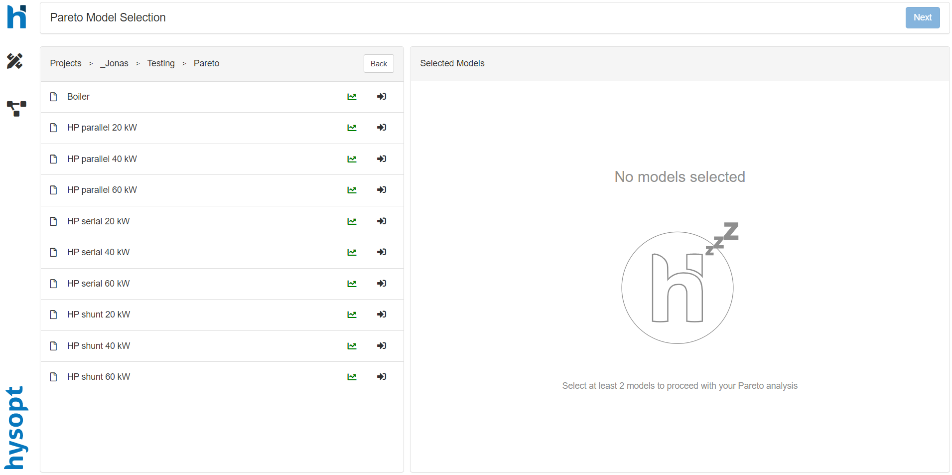
After clicking on the Pareto icon, a new page is opened with on the left the folder structure. In the folder structure, the user can navigate to the models desired to analyse.
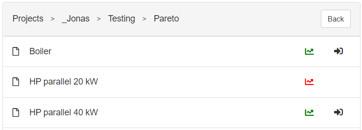
The models should be simulated to select for Pareto analysis. If the model isn’t simulated the graph icon is shown in red, if the model is simulated the icon is shown in green. The simulated models can be selected for a Pareto analysis by clicking on the arrow icon next to the graph icon.
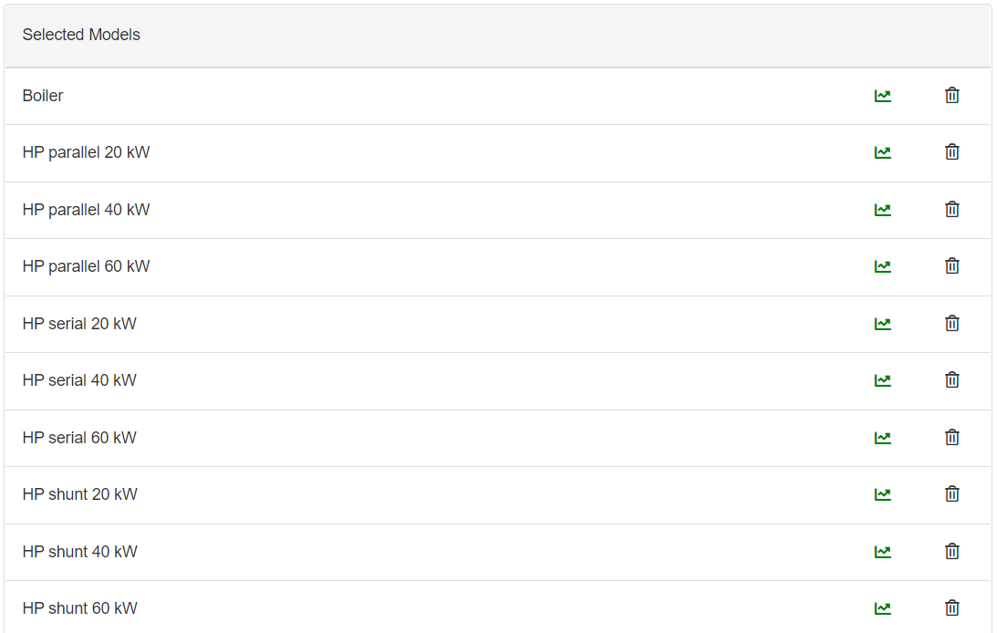
After selecting at least two models for the Pareto analysis, the selected models are visualised on the right side of the screen. If a model is selected which isn’t desired, it can simply be removed by clicking on the “garbage bin” icon.
After the model selection, the user should click on the “next” button on the top right corner of the Pareto dashboard. A new page will appear with the selected models on the left.
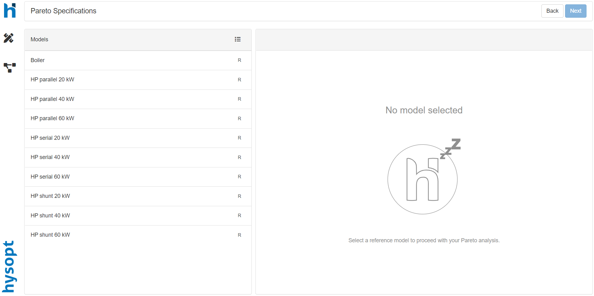
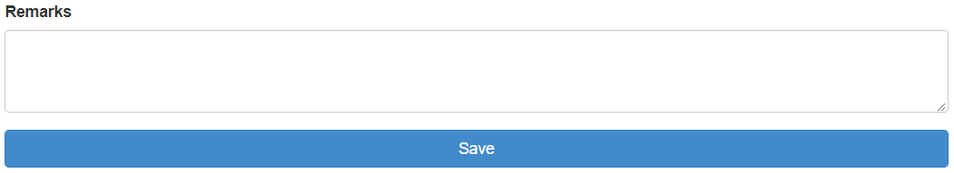
In this page, comments can be added for every model. By selecting a model, an input field is visualised on the right side of the screen.
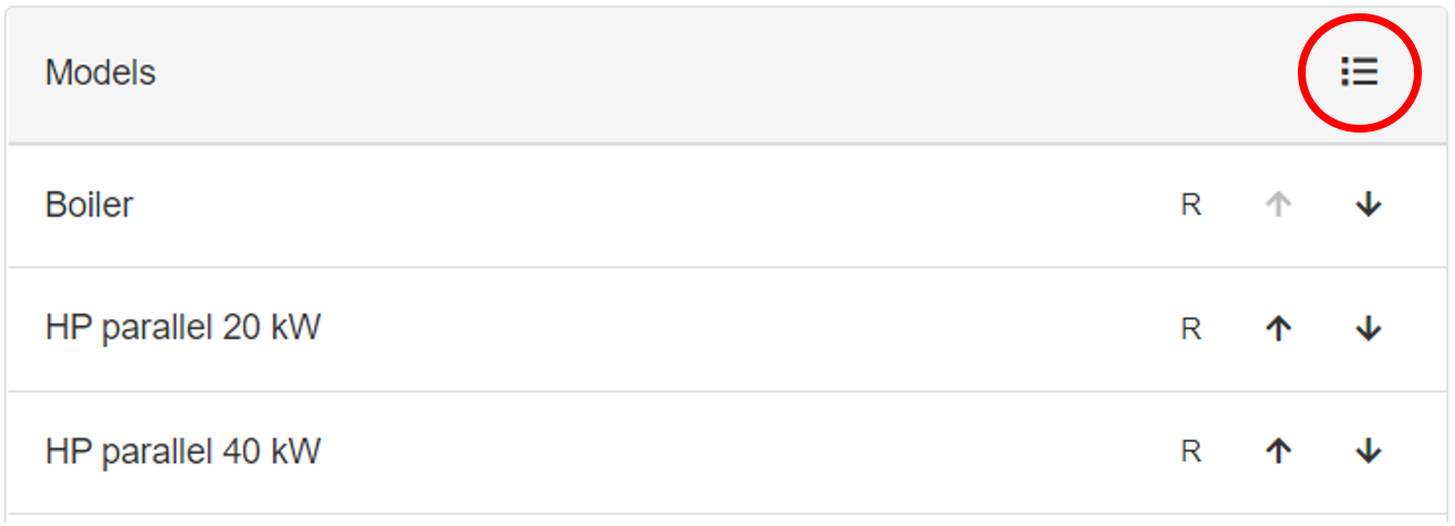
The order of the different models can be changed by clicking on the icon visualised with the red circle in the figure below. After clicking on the icon arrows will appear next to the models. The order of the models can be changed by clicking on the arrows. If the user clicks on the upward pointing arrow, the model will be switched with the model above, and the opposite will happen for the arrow pointing downwards.
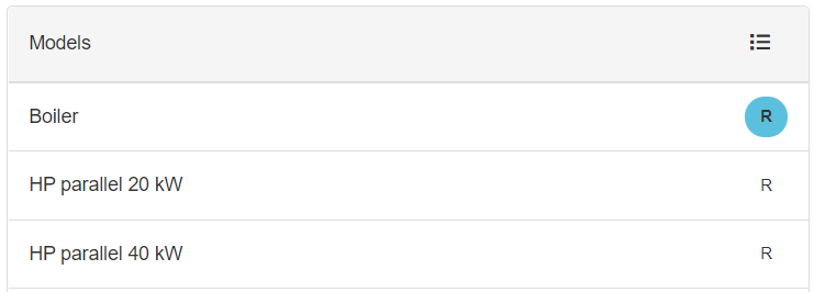
Besides adding comments to models and changing the order of the models, a reference model should be selected. A reference model is needed to calculate different aspects like for instance “energy cost savings”. A model can be selected as the reference by clicking on the “R” icon next to the models' name. After selecting the “R” icon, the icon turns blue.
If a reference model is selected, the user can go to
More information on the calculations can be found in …